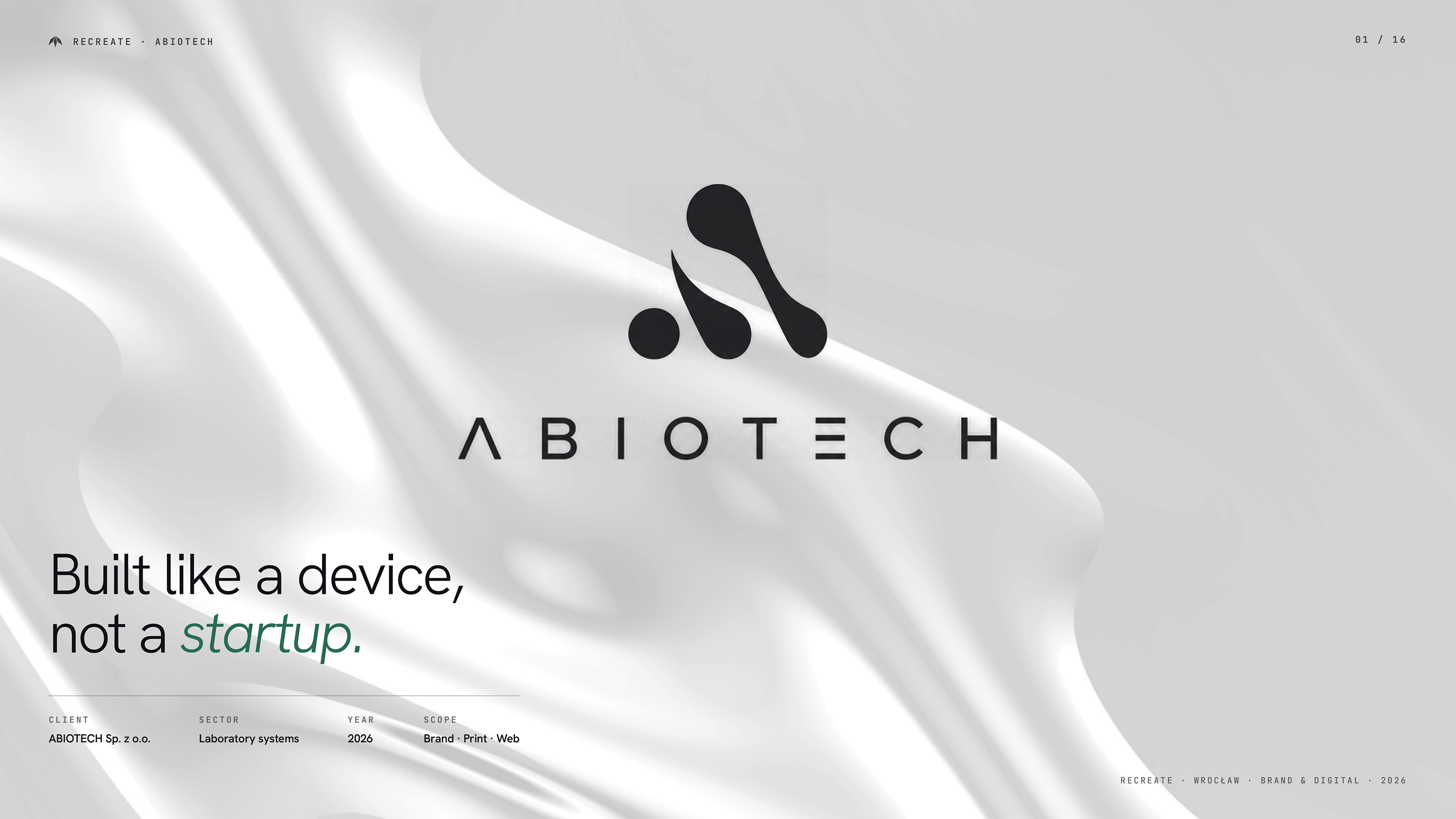
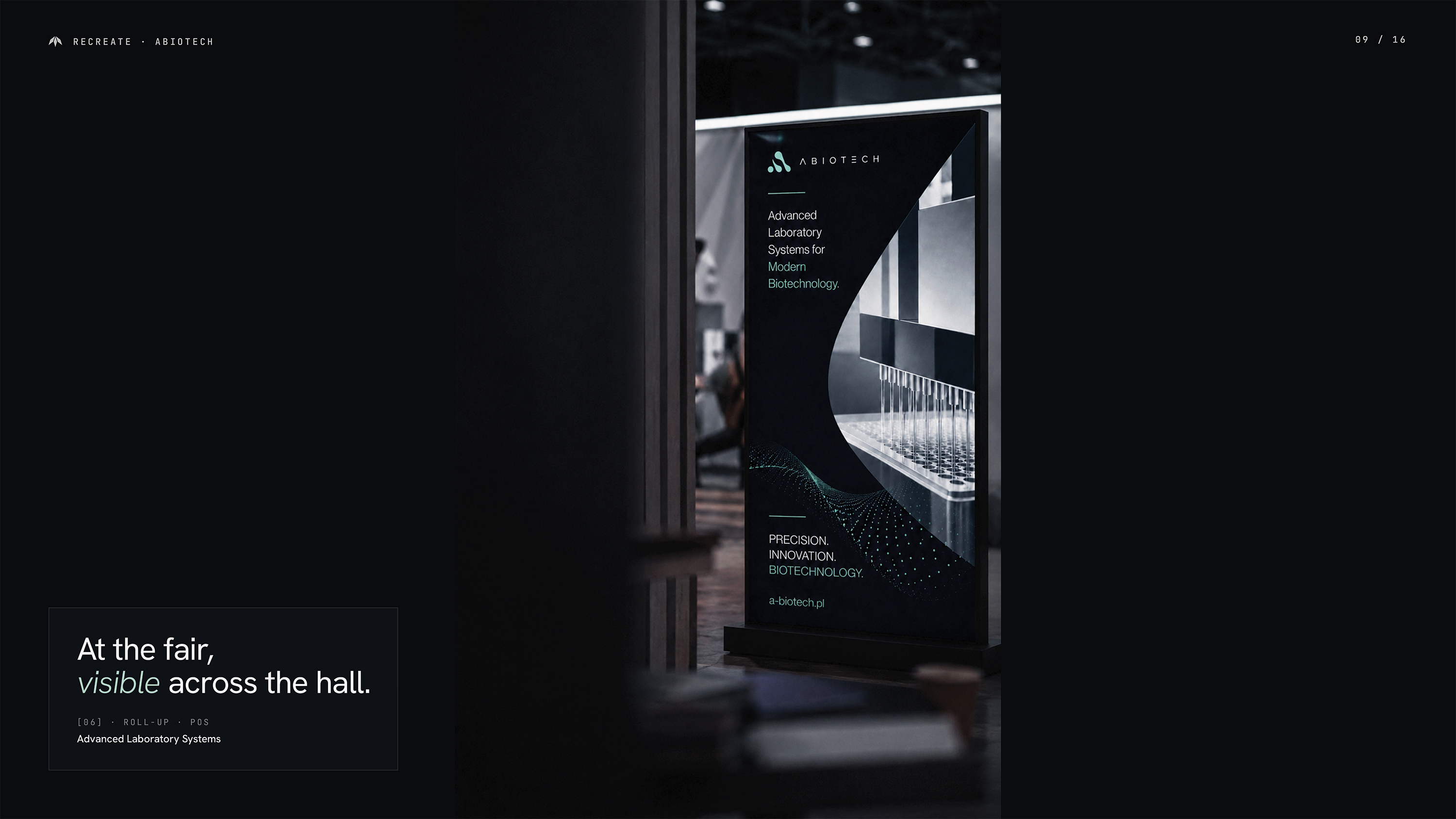
A precise visual identity and digital design system for a biotechnology company.
Client
A-Biotech Sp. z o.o.
Year
2026
Category
Brand Identity & UX/UI Design
Research
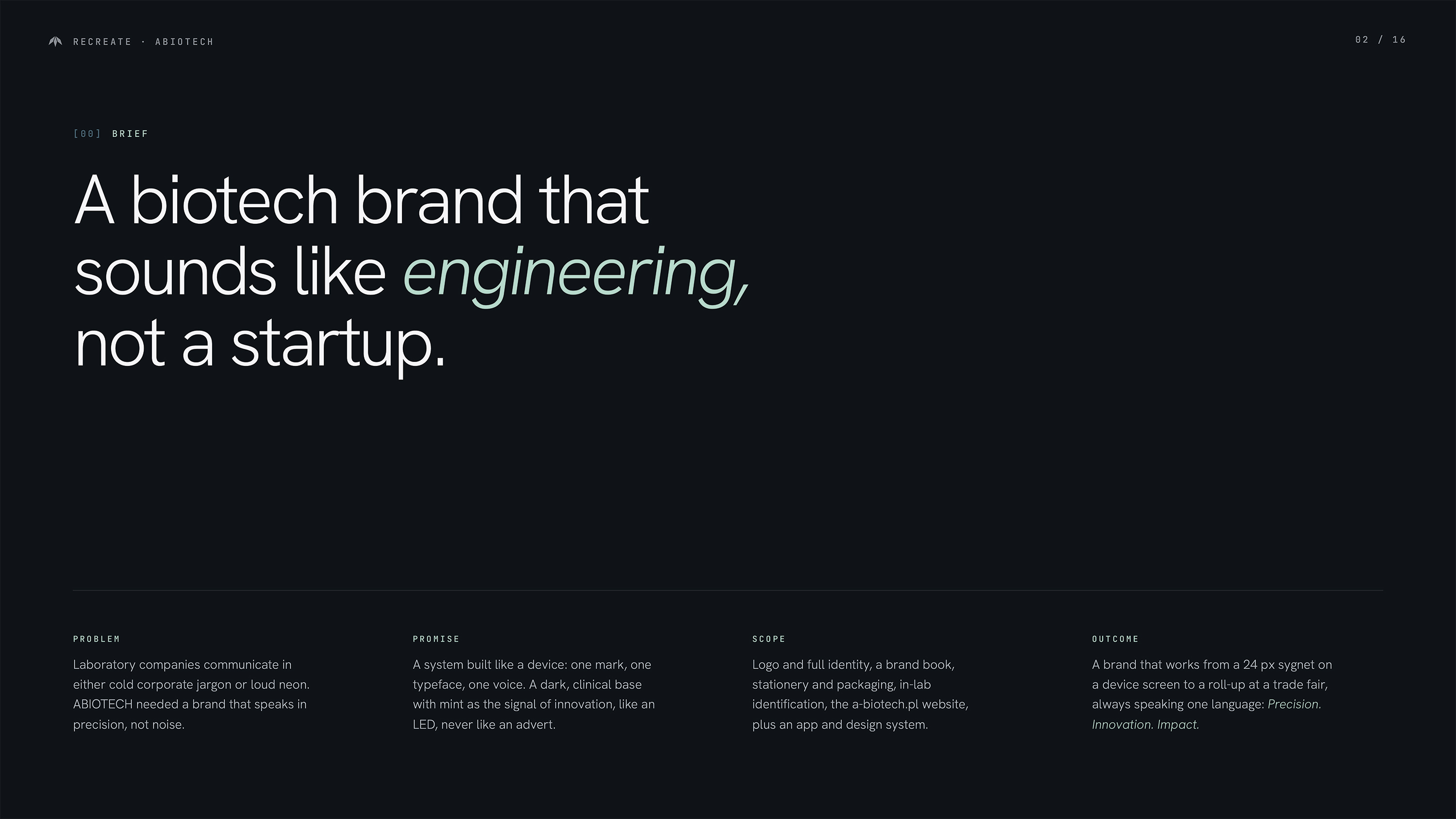
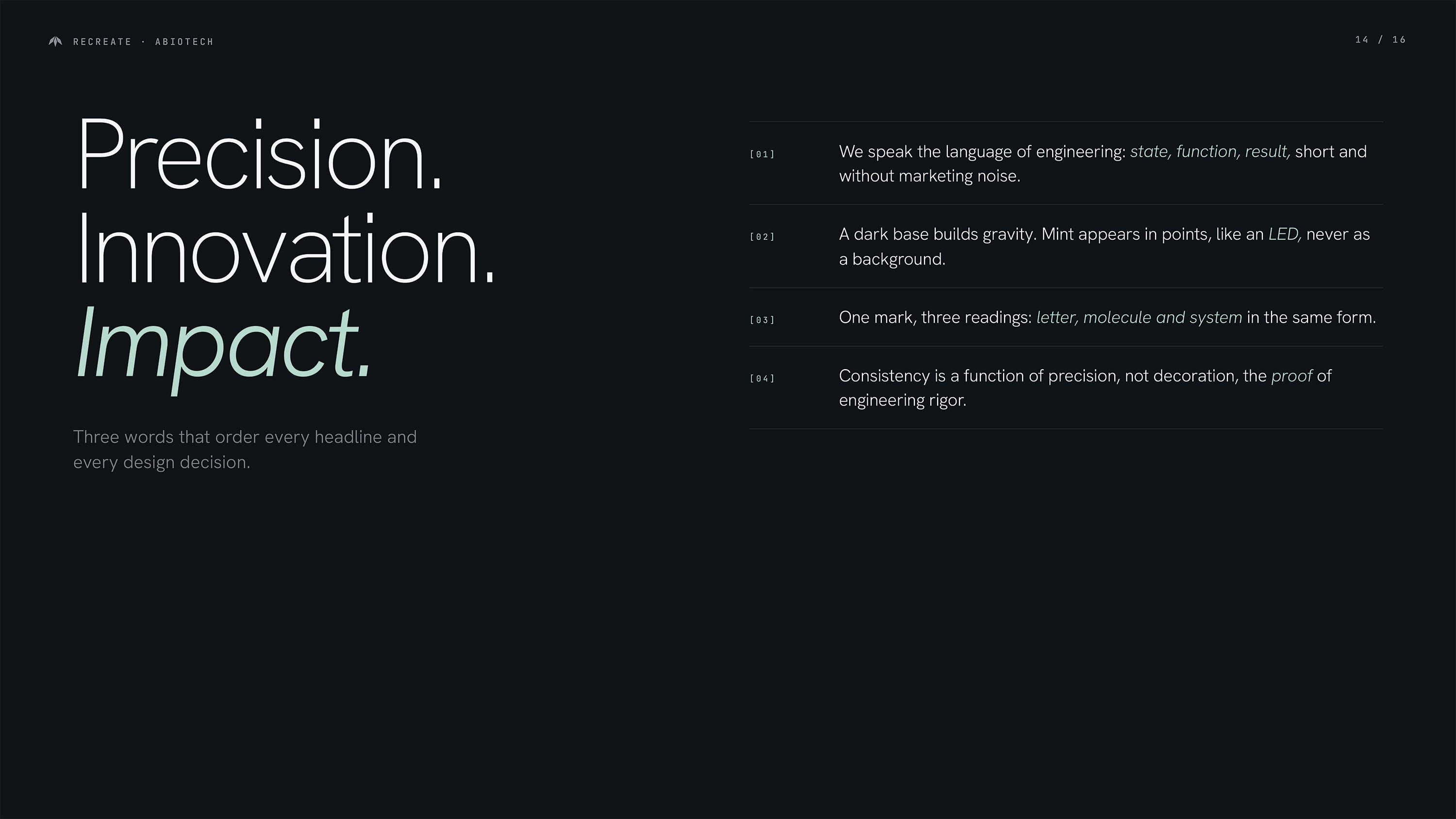
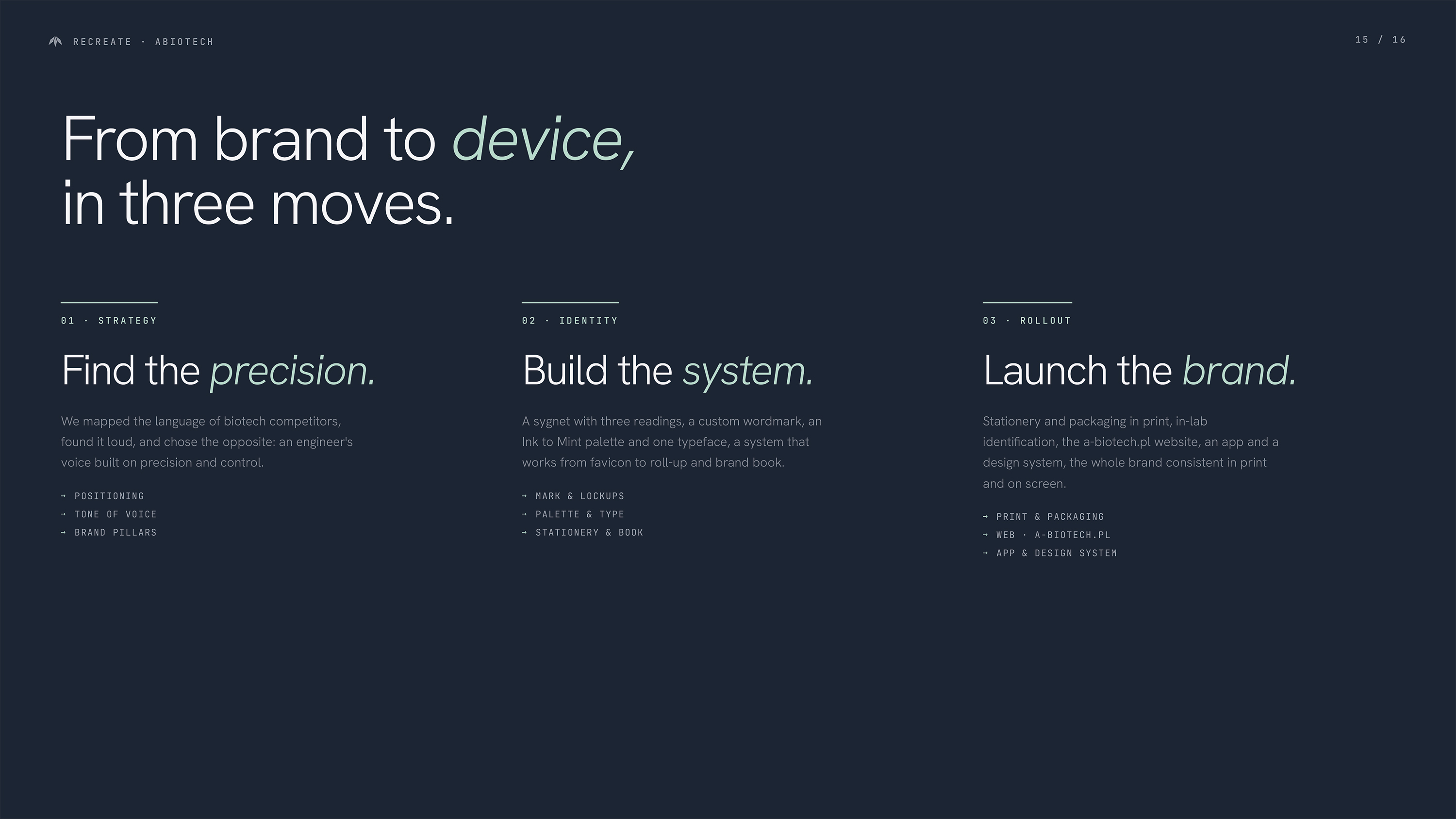
A-Biotech needed to communicate advanced technology without cold corporate conventions or loud biotech aesthetics. Competitor research led us to a clear position built on precision, modularity and control.
Design
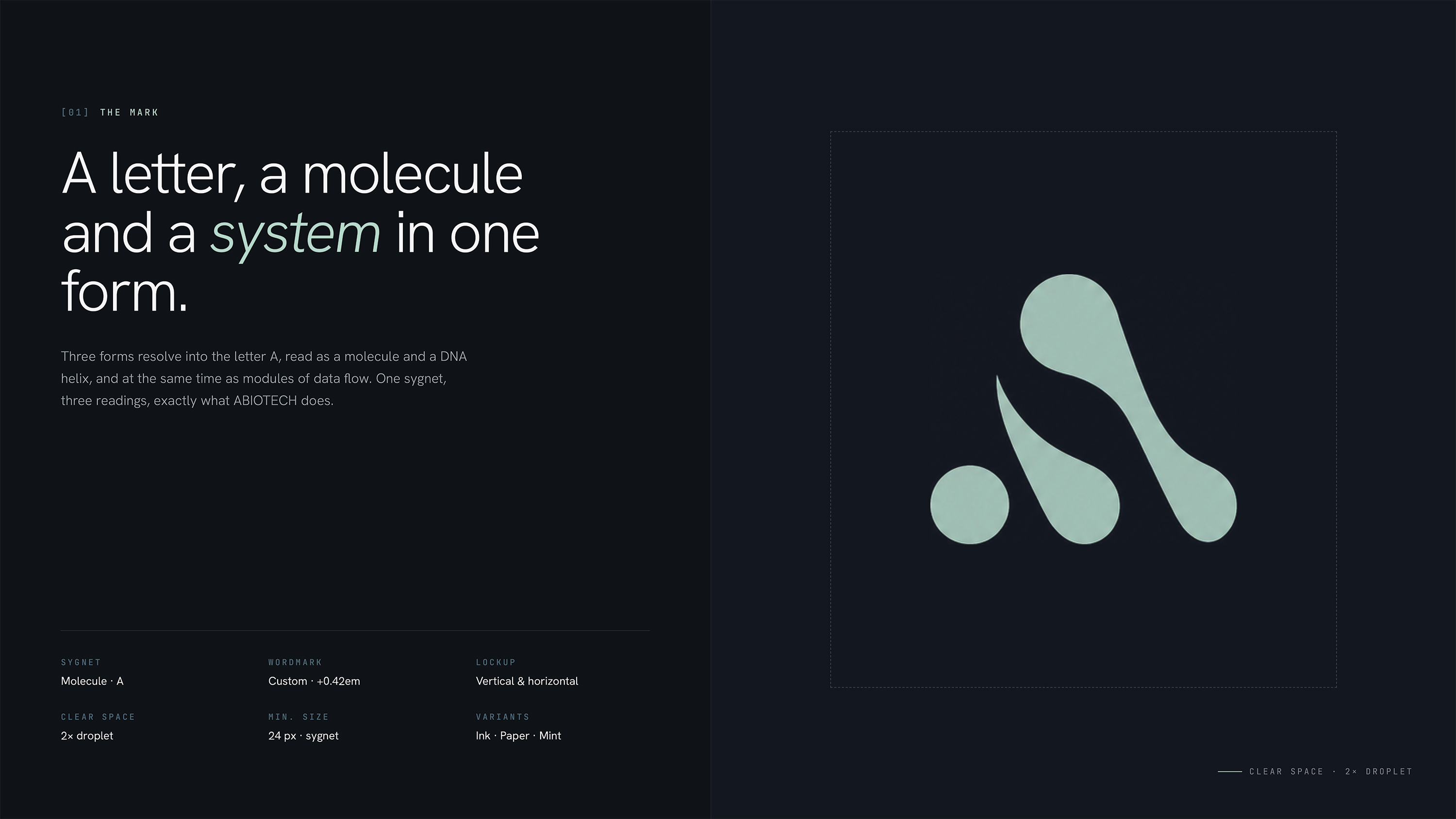
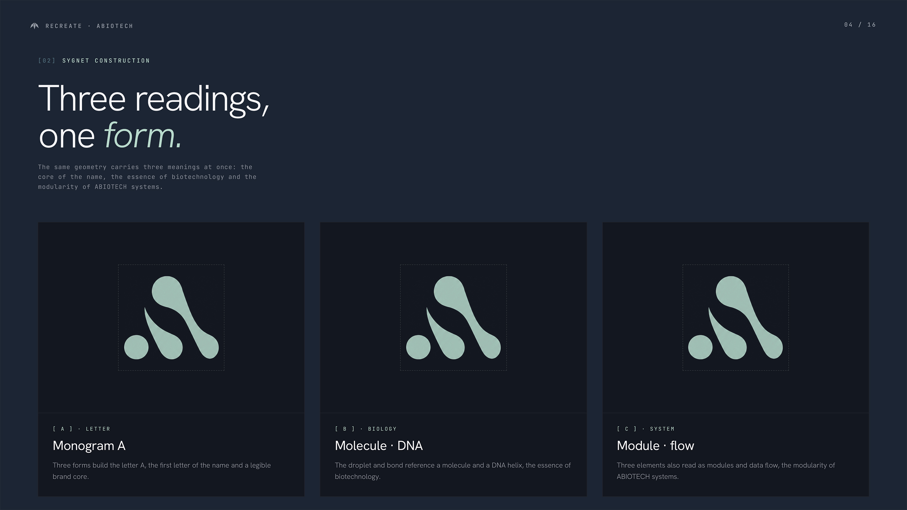
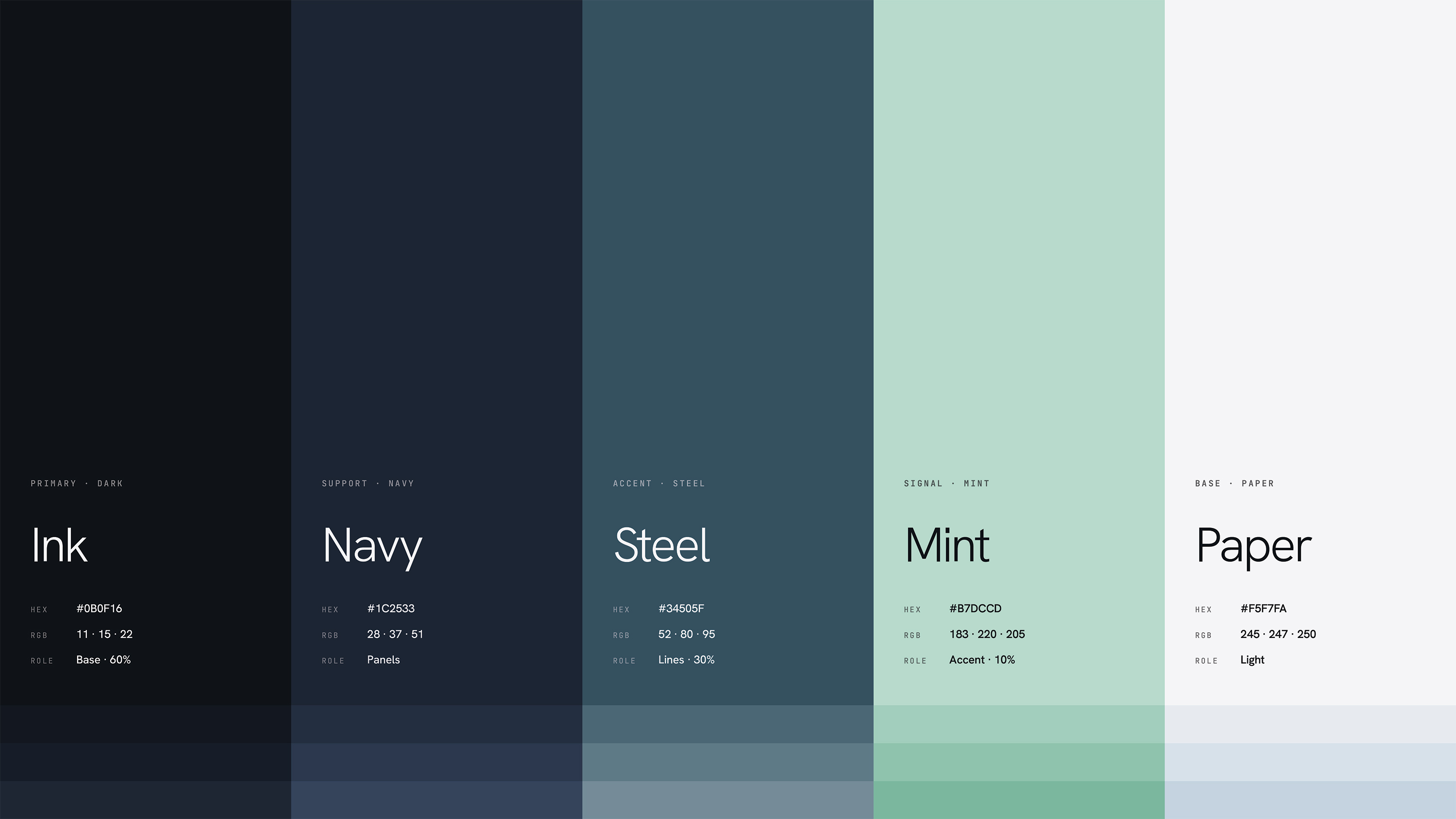
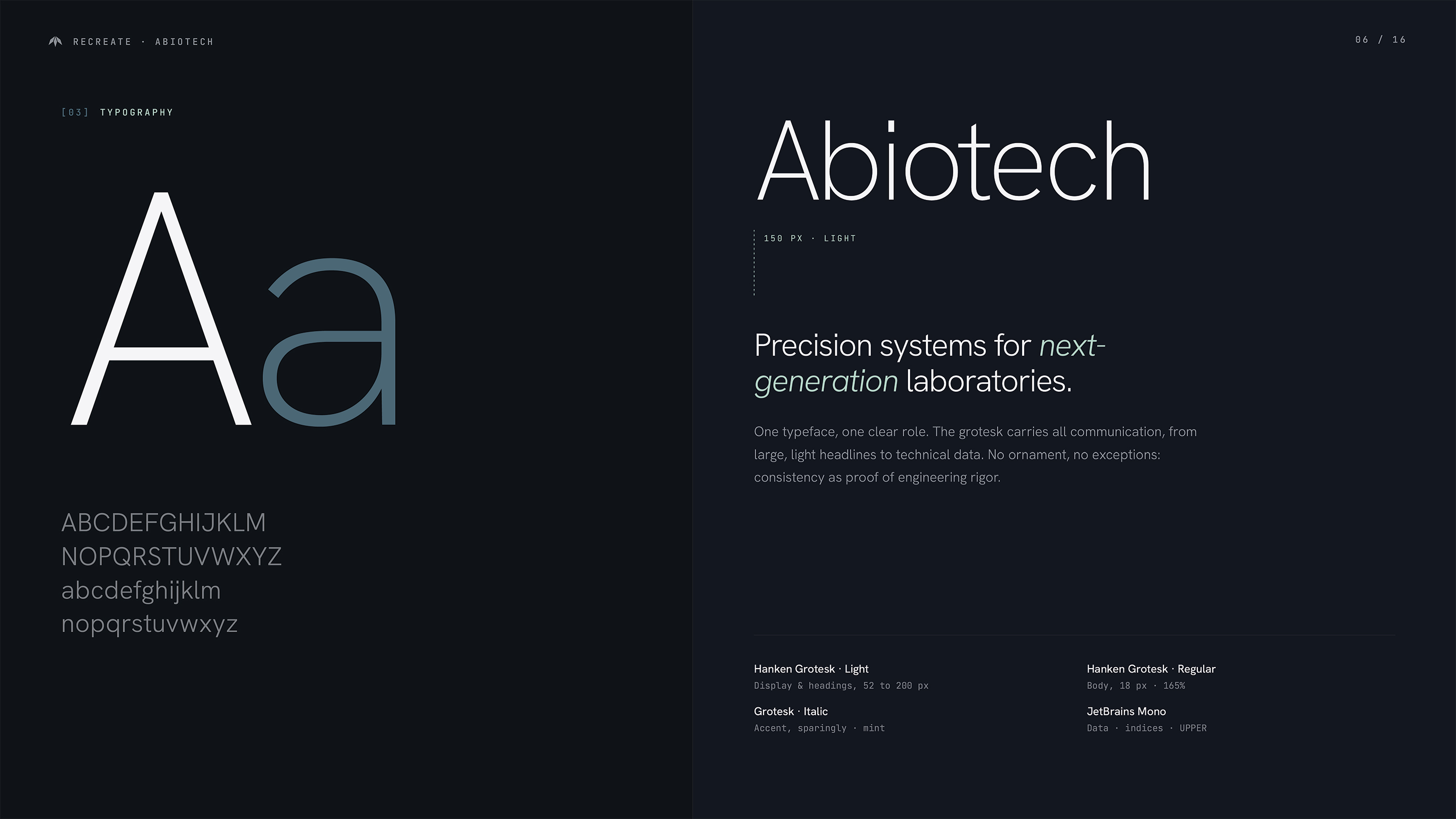
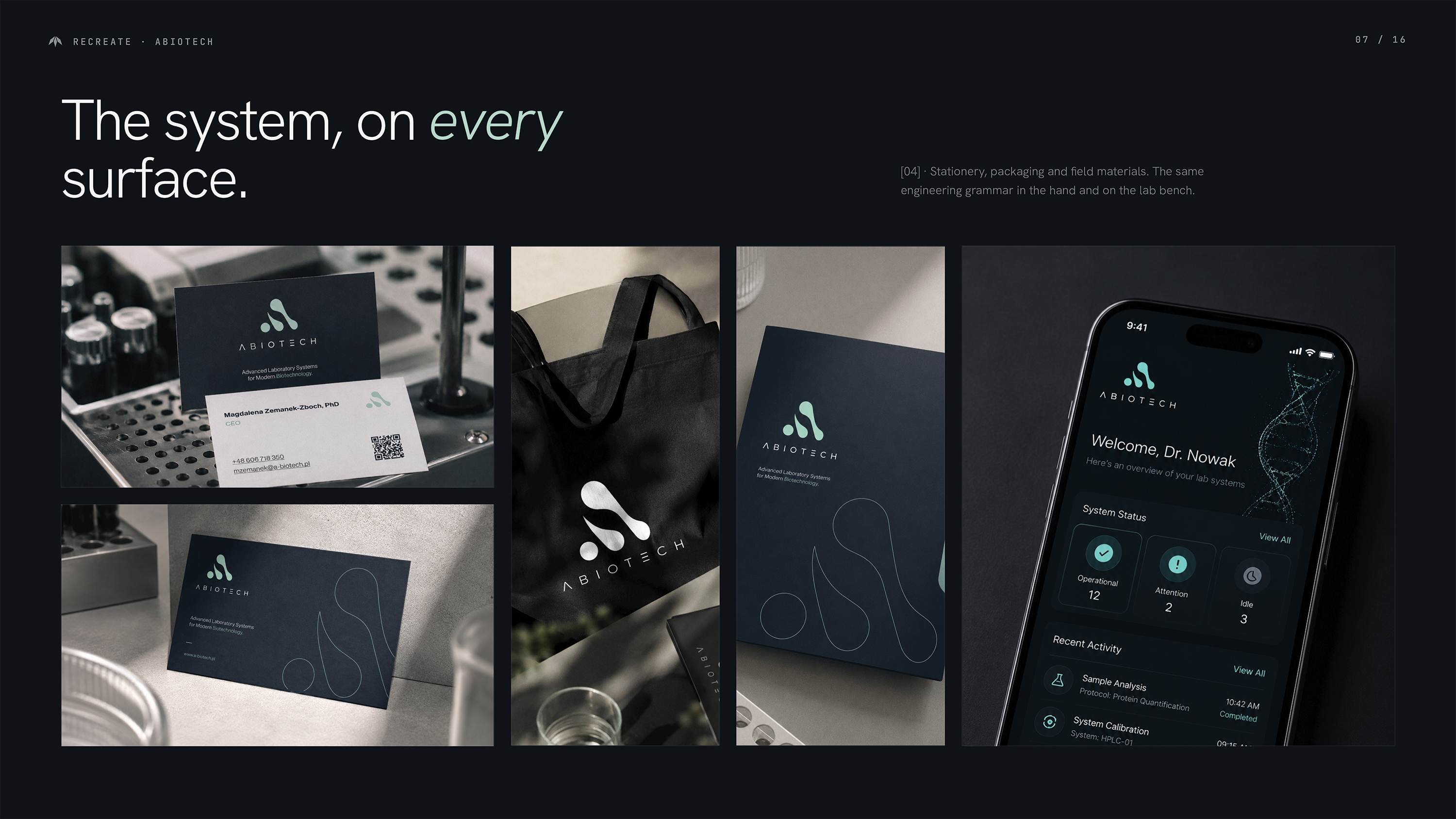
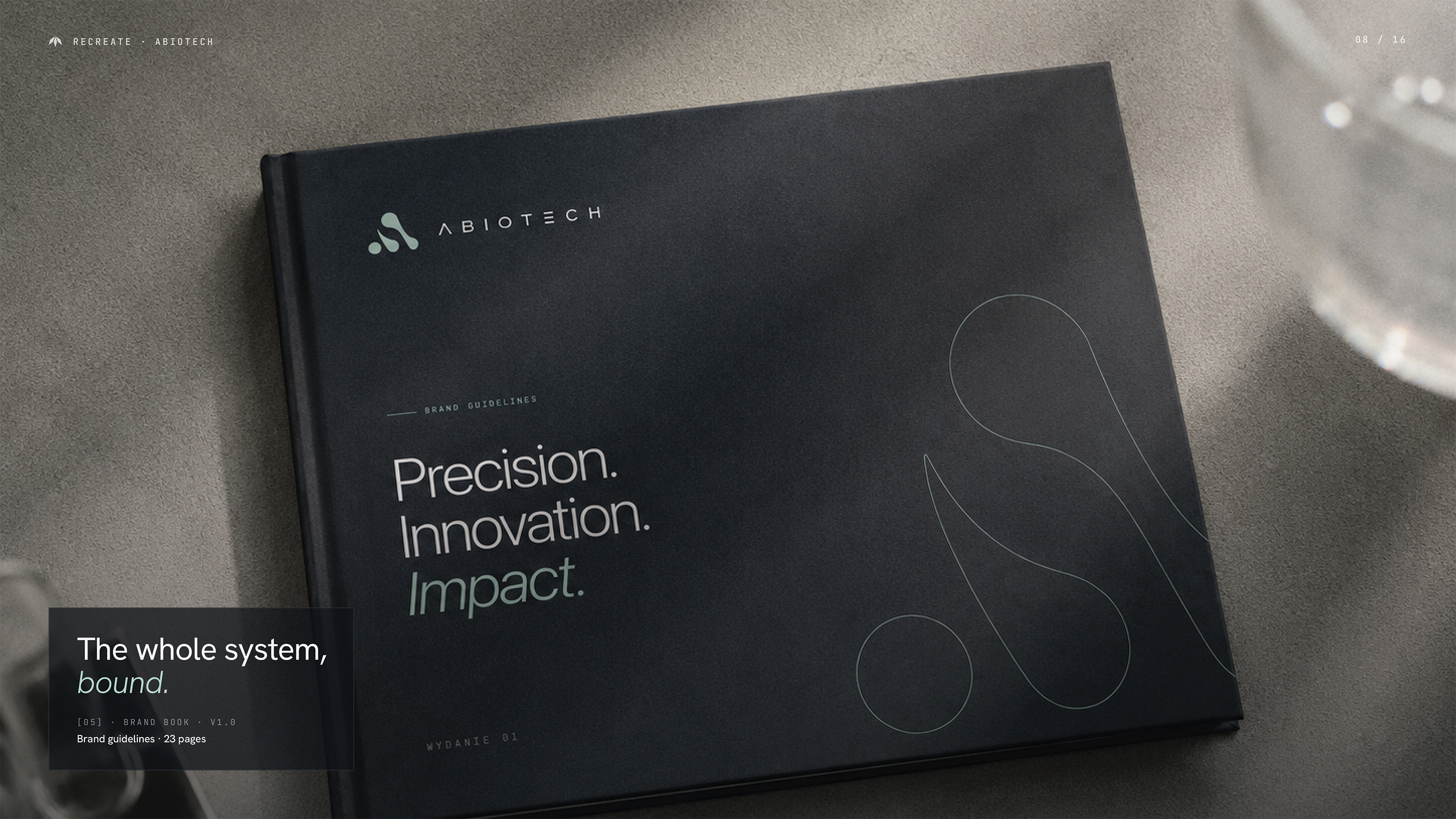
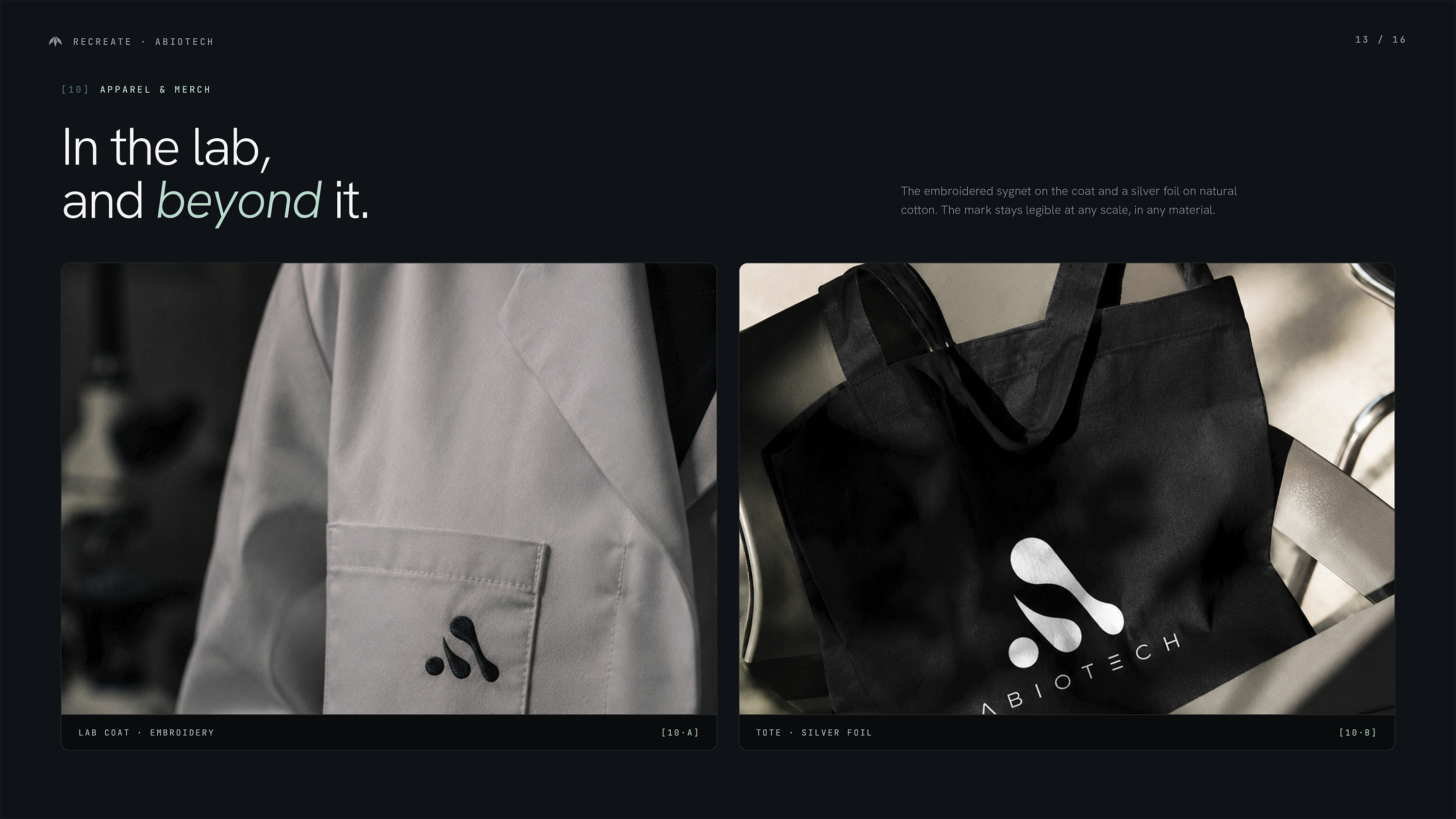
The symbol combines three meanings: the letter A, a molecule and connected modules. Precise typography, structured layouts and a restrained colour palette create a visual identity that works across print and digital applications.
Development
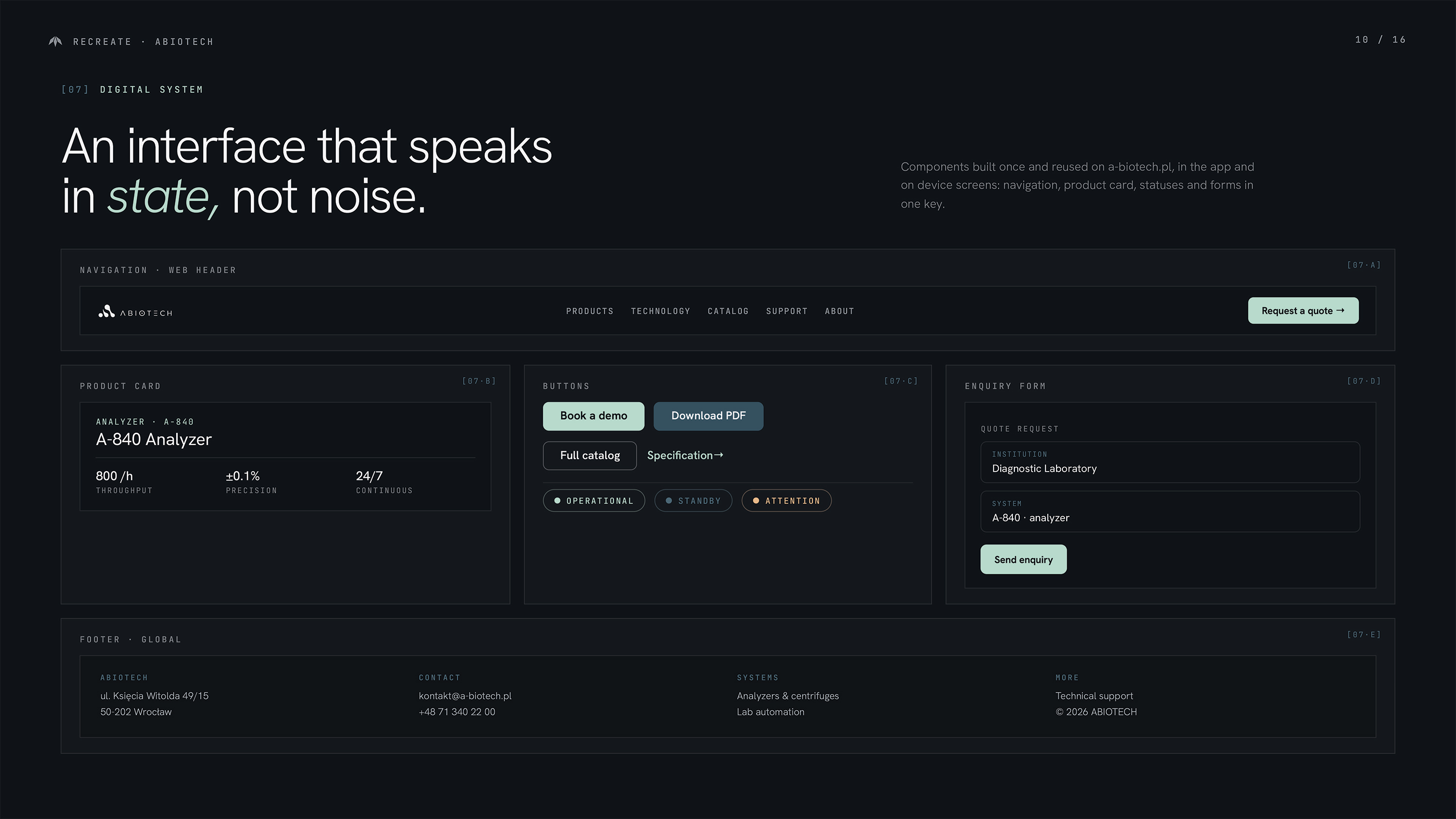
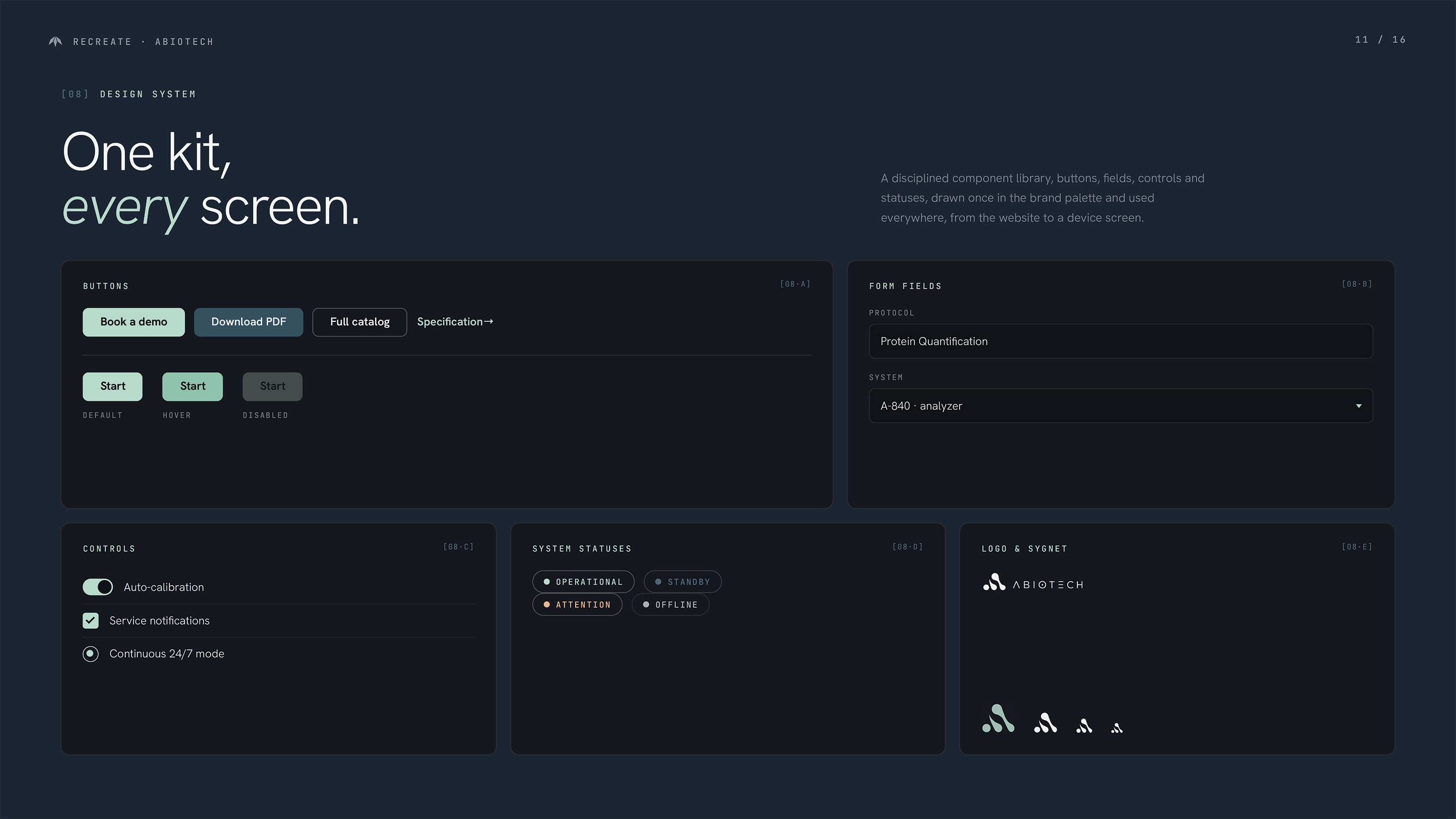
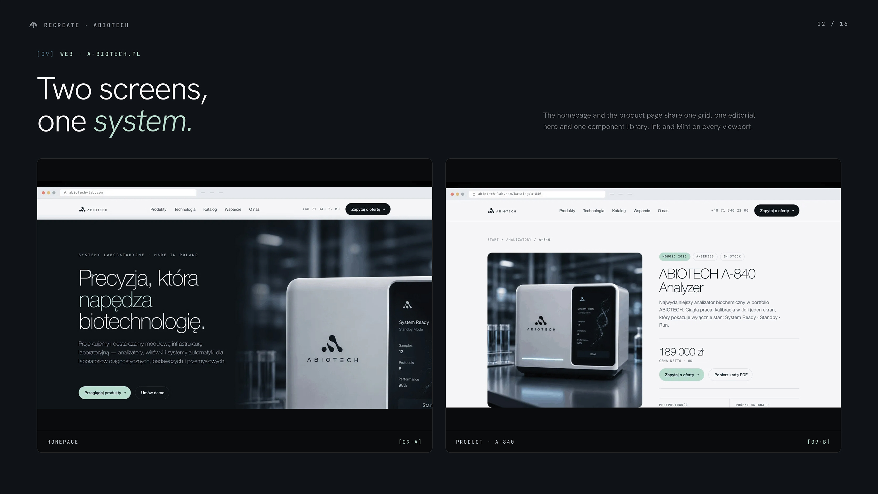
We translated the identity into a digital design system for the website, app and device screens. Reusable UX/UI components and responsive layouts keep every touchpoint clear and consistent.